A logo that rides the wave
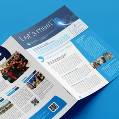
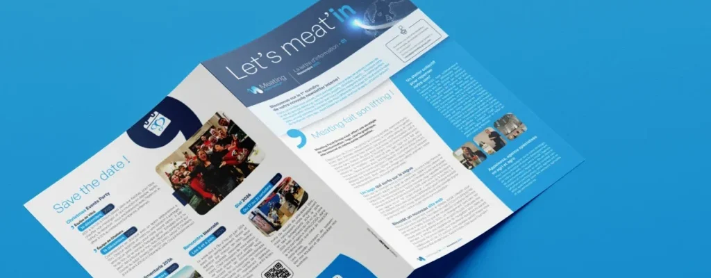
In 2025, Meating Food Group rolled out a communications strategy: a logo, a brand identity guide, a website and even an internal newsletter.
For over 20 years, Meating Food Group has been buying, selling and transporting foodstuffs across the globe. Such longevity is rare in this highly volatile market, and it is a testament to our reliability and expertise. All the more reason for our communications to match our ambitions! We have therefore embarked on a comprehensive initiative to rethink our communications, with the support of the Appaloosa Agency.
Aim: to present an image that truly reflects our professionalism… and our personality!
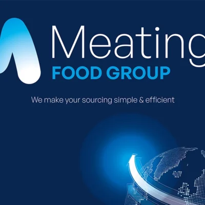
This process led to the launch of a new visual identity, symbolising our evolution and reflecting our values: reliability, friendliness, responsiveness, respect and loyalty. In particular, we wanted a simple logo that would stand the test of time and unite all our teams under a single banner. The design evokes the movement and flow that are part of our DNA, with a shape reminiscent of a wave or an ‘M’ (though everyone will see what they feel in it!). Our logo is available in different colours for each company within the Meating Food Group. We also have a new brand guidelines document to standardise all our communications. Finally, we have also joined the LinkedIn social network to boost our visibility. And of course, we have also revamped the website you are currently viewing!